
It was a Thursday in August when all hell broke loose. The place was Logan County, West Virginia. The year was 1921. Over the next week, one million rounds of ammunition would be fired. Up to a hundred people were killed. All told, it was the largest armed uprising since the American Civil War. Yet you’ve probably never heard of it. That’s because the battle was a labor dispute.
It was called the Battle of Blair Mountain. On one side were some 10,000 coal miners fighting to unionize West Virginian coal mines. On the other side was Sheriff Don Chafin, who commanded a private army backed by mine owners. The battle resembled modern warfare. Chafin hired private planes to drop poison gas and explosive bombs left over from World War I. Army bombers patrolled the skies.
The fighting ended when Federal troops arrived and the miners fled. In the aftermath, the West Virginian government indicted 985 miners for murder and treason. None of the anti-union militia (to my knowledge) were indicted.
✹ ✹ ✹
The Battle of Blair Mountain is part of a larger history of class struggle in the United States. It’s a history that has largely been forgotten.1 In this post, I’ll jog our collective memories.
True, many histories of working-class struggles have already been written. Howard Zinn’s A People’s History of the United States remains the classic.2 As I tell the story of US class struggle, I’ll be honest. I lack Zinn’s grasp of history. And I’m not blessed with his story-telling talent. I do, however, have one thing on my side — a bold new idea. I’m going argue that the history of US class struggle is written in the most unlikely of places … on the stock market.
Bichler and Nitzan’s radical idea
The idea that the stock market reflects class struggle is not my own. It comes from political economists Shimshon Bichler and Jonathan Nitzan. In ‘Stocks Are Up. Wages Are Down. What Does it Mean?’, I summarized their thinking (as I understand it). Before you continue here, I recommend reading that post. But if you’re pressed for time, here’s the gist of their argument.
Class struggle, Bichler and Nitzan observe, is a part of all hierarchical societies. But capitalism is the first social order to quantify this struggle. It does so through prices, which Bichler and Nitzan propose indicate power.
Take, as an example, the price of stocks. To mainstream economists, a stock price indicates a firm’s productive capacity. But to Bichler and Nitzan, this price indicates power. Here’s their reasoning. Stock prices are determined by capitalizing a firm’s income stream. But this income stream stems not from productive capacity, but from property rights — the institutional power to exclude.3
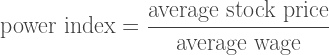
So stock prices, Bichler and Nitzan argue, indicate the power of owners to earn income. If we’re interested in class struggle, we want to compare this capitalist power to the power of workers. Here’s a simple way to do so. We compare the price of stocks to the price of wage labor. Bichler and Nitzan call this ratio the ‘power index’:
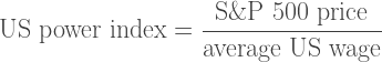
This index quantifies the power struggle between capitalists and workers.4 When applied to the United States, Bichler and Nitzan define the US power index as:
My goal here is to test Bichler and Nitzan’s thesis. Does the power index quantify US class struggle? We’ll get to the test shortly. But first, let’s look at the power index itself. Figure 1 shows how the US power index has changed over the last 150 years.

From the oscillation of the power-index, four eras of capitalism emerge. The power index rose in the late-19th century during the era of robber-baron capitalism. It declined in the early-20th century as the labor movement was born and monopolies were broken up. The power index reached a minimum in the decades after World War II — a period known as the ‘golden age of capitalism’. Then, from 1980 onward, the power index rose to new heights. The neoliberal era was born.
Take a mental snapshot of these power-index oscillations. We’ll revisit them throughout the post.
Although a simple ratio of two prices, the power index, Bichler and Nitzan claim, tells us about class conflict at large. When the power index falls, workers are winning the struggle. When the power index rises, capitalists are winning.
Is Bichler and Nitzan’s claim true? In this post, I look at the evidence. I test how three different indicators of class struggle relate to the power index. Here’s what I find. When workers strike more, win a living minimum wage, and get government to progressively tax the rich, the stock market declines relative to wages. My conclusion is that Bichler and Nitzan are onto something. The history of class struggle does seem to be written on the stock market.
The struggle to strike
When I was a teaching assistant at York University, my extended-healthcare benefits were better than at any job I’ve had before or since. Why? Was I more ‘productive’ as a TA? Doubtful. I’ve worked hard at every job I’ve had. Was York University intrinsically more generous? No. While I was there, the university actively sought to reduce TA benefits. (It didn’t succeed.)
So why the great benefits? The reason is simple. At York, the TA union was militant. We went on strike twice during my 7-year tenure. And one of those strikes (in 2018) was the longest university strike in Canadian history. So the reason I received good benefits was because York TAs were willing to flex their collective muscles. They were willing to strike.
My experience is anecdotal. But there’s no reason that it shouldn’t generalize. The more workers strike, the more power they’ll have relative to capitalists. So striking, I propose, is a key measure of class struggle.
With this idea in mind, let’s look at something I call strike density. This is the portion of the labor force involved in strikes. Figure 2 shows strike density in the United States over the last century and a half. (Note that the vertical axis uses a logarithmic scale.)
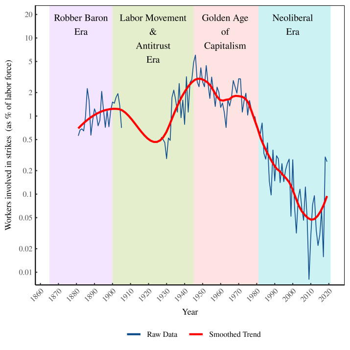
With the strike data in hand, let’s review some US labor history. Today the right to strike is protected by the government. But this was not always the case. Prior to 1935 (when the right to strike was first legislated), workers went on strike at their own peril.
The Battle of Blair Mountain was perhaps the most extreme example of this peril. In the melee, one million rounds of ammunition were fired. Up to a hundred people were killed. All for a labor dispute. Today, this level of violence seems unthinkable. But in the early-20th century, US strikes often involved gunfire.
Coal-mine strikes were particularly brutal. Consider another poorly known event — the Ludlow Massacre. In 1914, striking coal miners set up a tent colony in Ludlow, Colorado. The mine owner, John D. Rockefeller Jr., didn’t approve. And so he orchestrated a massacre. On April 20, 1914, the Colorado National Guard and anti-union militia rained machine-gun fire onto the colony. Twenty-one people were killed. Commenting on the massacre, Howard Zinn writes that it was “the culminating act of perhaps the most violent struggle between corporate power and laboring men in American history”. (See his book The Politics of History for an account of the massacre.)
Despite the danger they faced, US workers still managed to strike. In the late-19th century, about 1% of the labor force was involved in strikes (see Figure 2). Unfortunately, there’s a gap in the data from 1905 to 1927, so we don’t know what strike density was like in the early-20th century. But we know that by the mid-1930s, strikes were on the rise.
Strike density peaked in 1946 in a period of raucous labor unrest. Now known as the strike wave of 1945–1946, roughly 6% of the workforce went on strike (at the peak). That’s about 1 in every 16 workers. In response to the unrest, the US government passed the 1947 Taft-Hartley Act. Still in effect today, the act restricted the rights of unions. It banned political donations by unions and outlawed ‘closed shops’ (workplaces that hire only union members). The Taft-Hartley Act also paved the way for the union-crushing … sorry, ‘right-to-work’ laws that are now enacted in 27 states.
Although union rights were restricted after 1947, during the 1950s and 1960s strike density remained high. This fact is worth remembering, as the post-WWII era was not a period of instability. It was the most prosperous era in US history.
By the 1980s, things began to change. The defining event happened in 1981, when 13,000 air traffic controllers went on strike. Ronald Reagan, then president, declared the strike illegal and ordered the controllers back to work. When only 1,300 controllers returned to the job, Reagan fired the remaining 11,000. (He also banned them from government employment for life.) The message from government was clear: strike at your own peril. Given this stark message, it’s no surprise that in the ensuing decades, strike density collapsed.
Let’s reflect on the scale of this collapse. During the strike wave of 1945–1946, about 5% of the labor force was involved in strikes. During the 1950s and 1960s, this figure remained high, at around 2%. Then came the neoliberal drop. By the 2000s, only about 0.09% of the workforce participated in strikes. That’s a 20-fold drop from the 1950s. The absolute minimum came in 2009, when only 0.008% of the workforce participated in strikes. That’s a 700-fold drop from the peak in 1946. (And it’s not like workers were refusing to strike in 2009 because things were great. That was the era of the Great Financial Crisis.)
So we have, in Figure 2, a quantitative history of US strikes. Few people would deny that this history is about class struggle. What’s not clear, however, is that this strike history relates to the stock market. And yet it does.
Figure 3 shows the correlation between strike density and the US power index. When more workers go on strike, the power index tends to fall — meaning stock prices decline relative to wages. When fewer workers go on strike, the power index tends to rise — meaning stock prices grow relative to wages.
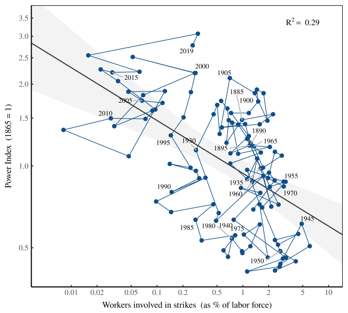
Here’s the take-home message. When workers flex their muscles by striking, this power seems to be reflected on the stock market. Point for Bichler and Nitzan’s hypothesis.
The struggle for a living minimum wage
Strikes aren’t the only way that workers can flex their muscles. Another option is for workers to influence government policy. They can get government to set a living minimum wage.5
Think of a minimum wage as setting a lower bound on the price of labor. That’s good for low-wage workers — it gives them a decent standard of living. But it’s bad for capitalists — it raises their costs. So if workers had their way, the minimum wage would be high. But if capitalists had their way, the minimum wage would be low (or not exist). So the size of the minimum wage reflects the balance of power between workers and capitalists.
With this dynamic in mind, let’s look at the history of the US minimum wage. Figure 4 plots the federal minimum wage since its inception in 1938. (The first state minimum wage was set by Massachusetts in 1912.)

When you look at the dollar value of the minimum wage, the picture looks rosy. Since its inception, the minimum wage has grown by a factor of 29. That’s progress, right?
Maybe.
The problem is that over the last 80 years, it’s not just the minimum wage that’s grown. All prices have increased. So the next thing we need to ask is — what’s the minimum wage’s purchasing power. To measure this purchasing power, we’ll compare the minimum wage to the consumer price index. (The consumer price index measures the average price of frequently-bought commodities.)
When we measure the minimum wage’s purchasing power, the results aren’t as rosy. Figure 5 shows the trend. Instead of a step-wise trend to better wages (as in Figure 4), we now have a saw-tooth dance. It’s composed of two parts. When the minimum wage rises, its purchasing power shoots upward instantly. But then inflation slowly wears away at this gain. The result is a saw-tooth dance between wage policy and inflation.
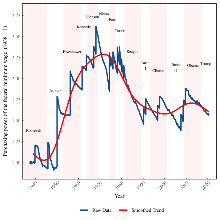
What’s more interesting than the saw-tooth shape is the long-term trend in the wage’s purchasing power. This trend gives a clear indication of who’s influencing government. For the first 30 years after the minimum wage’s inception, it’s clear that workers got their way. Between 1938 and 1968, the wage’s purchasing power grew by about 250%. Then came the 1970s, which were a period of stasis. Under Nixon, the wage’s purchasing power declined somewhat, mostly because inflation was high and Nixon raised the minimum wage only once. Ford and Carter then held the wage constant (against inflation).
That brings us to Ronald Reagan. As president, Reagan made clear that he was on the side of business. Unsurprisingly, he was the first president to refuse to raise the minimum wage. The result was a massive decline in the wage’s purchasing power during the 1980s. When Reagan left office, the wage’s purchasing power didn’t recover. Instead, ensuing presidents held it roughly constant. Today, the purchasing power of the federal minimum wage is about 40% less than it was in 1968.
Figure 5 tells a dreary tale of minimum-wage workers being beaten back. And yet the tale gets worse. That’s because the most important aspect of the minimum wage isn’t its purchasing power. What’s most important is the relative income it provides.
Here’s the difference. Imagine two people, Alice and Bob. Alice is a cook who earns minimum wage. Her wage grows with time, but just enough to match inflation. Bob, in contrast, is a C-suite executive who earns far more than minimum wage. And to make things worse, his income grows faster than inflation. So relative to Bob, Alice’s income isn’t just staying constant. It’s actually declining.
Sadly, this isn’t a hypothetical example. It’s what has happened in the United States. Since the 1980s, the income of minimum-wage workers has barely kept up with inflation. Yet top executives have seen their inflation-adjusted income skyrocket. So in relative terms, the minimum wage has actually declined.
Here’s one way of quantifying this decline. We’ll assume that a minimum-wage earner works full time — 40 hours per week, 52 weeks a year. We’ll calculate their annual income and compare it to the American average. (We’ll measure average income using gross domestic income per capita.)
Figure 6 shows the resulting trend in relative income. It’s far worse than the trend in purchasing power (Fig. 5). Since the 1970s, the relative income of a full-time minimum-wage worker has plummeted.

With Figure 6 in hand, let’s talk minimum-wage history. The federal minimum wage was created in 1938 by Franklin D. Roosevelt as part of his New Deal. Roosevelt had previously tried to legislate a minimum-wage in 1933, but the bill was struck down by the Supreme Court.
At its inception, the minimum wage was $0.25 per hour. Today, this sum seems meagre. But at the time it is generous, giving a full-time minimum-wage worker about 80% of the average American income. To put this value in perspective, note that after 1940 it was never reached again. This testifies to the progressiveness of Roosevelt’s New Deal.
In the 1950s and 1960s, the relative value of the minimum wage remained high. During this time, a full-time minimum-wage worker earned about 70% as much as the average American. But by the 1970s this income began to decline. When Reagan ushered in the neoliberal era, the decline accelerated. It continued under all subsequent presidents. By 2019, a full-time minimum-wage worker took home just 23% of the average US income. Compared to the wage’s peak in 1939, that’s a near 4-fold drop.
The trend in Figure 6 is a clear indicator of class struggle. The creation of the minimum wage (in 1938) was the result of years of activism. The fact that the wage was ample — and remained so for the next 30 years — testifies to workers’ power during this period. But during the neoliberal era, business seized power. And so the relative value of the minimum wage plummeted.
While the battle over the minimum wage is obviously about class struggle, it’s not clear that this struggle has anything to do with the stock market. And yet it does.
Figure 7 compares the relative income of a minimum-wage worker to Bichler and Nitzan’s power index. When the relative income of a minimum-wage worker increases, the power index decreases — meaning the stock market declines relative to the average wage. Conversely, when the relative income of minimum-wage worker decreases, the power index increases — meaning the stock market grows relative to the average wage.
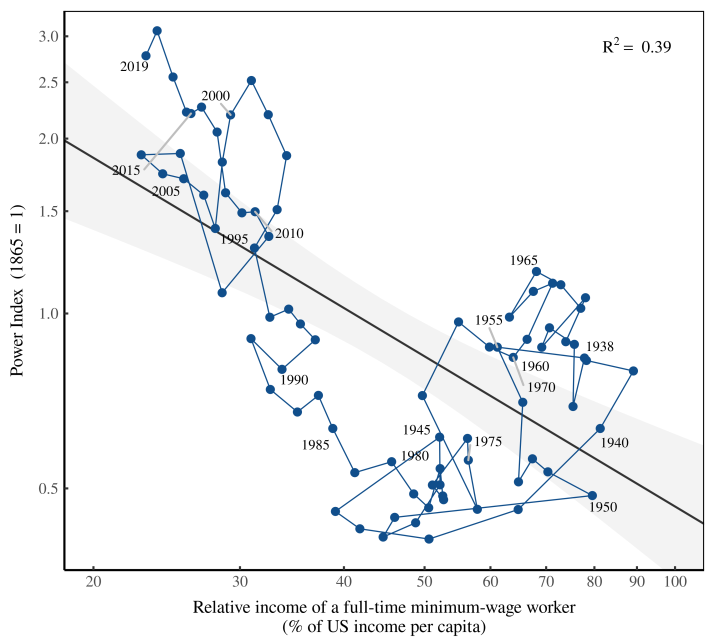
Again, it appears that Bichler and Nitzan are onto something. The price of stocks (relative to wages) seems to reflect a wider class struggle. When workers fail to win a living minimum wage, stocks surge.
The struggle to tax the rich
Think of a generous minimum wage as a social safety net. It stops incomes from getting too small. The corollary for the rich is the social safety whip. If incomes get too large, we whip them down to size. How? Using taxes.
It makes sense then that the history of class struggle should be written in tax rates. Here’s the dynamic at its most basic. Workers want to tax the rich. Capitalists want to tax the poor.
Yes, this is a simplification … but a reasonable one. People who earn income from wages and salaries tend not to be rich, and so favor progressive taxation. But people who earn most of their income from property tend to be rich, and so favor regressive taxation. The structure of taxation therefore tells us who’s winning the labor-vs-capital class struggle.
Let’s have a look at this tax structure. We’ll start with the simplest measure of how the rich are taxed — the top marginal tax rate. Figure 8 plots this rate since the inception of federal income tax in 1913.
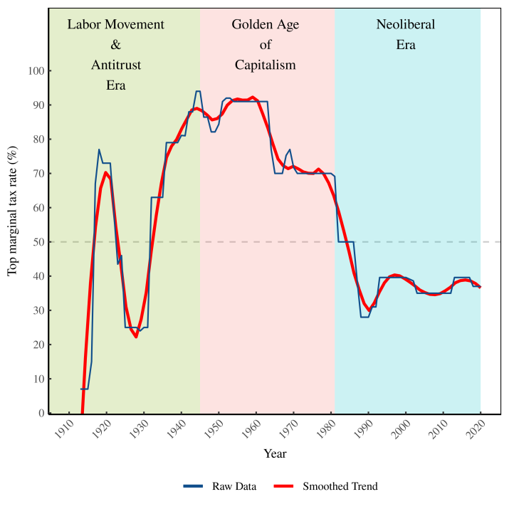
When income tax was first introduced, the top tax rate was a mere 7%. This rate was immediately hiked during World War I. But when the war ended, the top tax rate was lowered. By the late-1920s it was down to roughly 25%. During the 1930s, the top tax rate rose again as the New Deal was passed. It stayed high during World War II, peaking at a rate that is today unimaginable. In 1945, the top tax rate was 94%.
When World War II ended, something interesting happened. Instead of plummeting (as it had after WWI), the top tax rate remained high. During the 1950s and 1960s, it averaged 85%. Again, it’s worth remembering that this was a period of unprecedented prosperity. (High taxes, it seems, don’t kill the economy.)
It wasn’t until the 1980s, when Ronald Reagan took office, that taxes were slashed. During his tenure, Reagan cut the top tax rate from 70% to 28%. No president since has managed to raise this rate significantly. Today, the top marginal tax rate is about 37%. That may sound high, but it’s a 2.5-fold drop from the 1945 peak.
Let’s move on to another measure of how the rich are taxed. We’ll look at the tax rate that top earners actually pay. This is called the effective tax rate — taxes actually paid as a portion of total income. The effective tax rate usually differs from the official tax rate because there are many ways of avoiding taxes. Some methods are legal (such as exploiting tax loopholes). Other methods are illegal (such as hiding money in tax havens). Regardless of the method, the rich usually pay less tax than the official tax rate.
In their book The Triumph of Injustice, Emmanuel Saez and Gabriel Zucman estimate what the rich actually pay in taxes. Figure 9 shows their data — the effective tax rate paid by the top 0.1% of US earners.
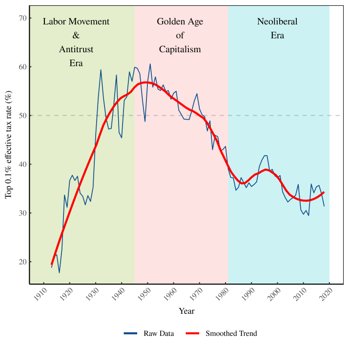
The trend in the effective tax rate (an inverted U) looks similar to the trend in the official top marginal tax rate. The effective tax level, however, is quite different. During the 1950s and 1960s, for instance, the official top tax rate averaged 85%. But the effective tax rate was far less — averaging about 54%.
I’ve marked in Figure 9 the 50% tax threshold (the dashed horizontal line). It’s a threshold that is mentally significant. Above this rate, top earners give more than half of their income to the government. An effective tax rate over 50% was first achieved in the 1930s and lasted until the late-1970s. But since then, the effective tax rate paid by top earners has plummeted.
In 2018, US taxation passed a dubious threshold — it became truly regressive. In that year, the 400 richest individuals paid an effective tax rate that was lower than the rate paid by the bottom 10% of earners. (See the data visualized in this New York Times article.) Here’s how billionaire Warren Buffet framed this absurdity. Despite earning far more money, he paid an effective tax rate that was lower than his employees.
Clearly, US workers are losing the struggle to tax the rich. It’s a loss that plays out daily in the media. Any talk of progressive taxation elicits screams of ‘class warfare’. Of course taxing the rich is class warfare. But what goes unmentioned is the opposite class war that’s been waged successfully. For the past forty years, the rich have used tax law to wage war on the poor.
So we have, in Figures 8 and 9, a history of the struggle to tax the rich. It’s a history that’s obviously about class conflict. But what’s not obvious is that this struggle over taxes relates to the stock market. And yet it does.
Figure 10 compares the top marginal tax rate to Bichler and Nitzan’s power index. When the top tax rate increases, the power index decreases — meaning stock prices decline relative to wages. Conversely, when the top tax rate decreases, the power index increases — meaning stock prices grow relative to wages.

The same trend appears when we look at the effective tax rate of the rich. Figure 11 compares the effective tax rate paid by the top 0.1% to Bichler and Nitzan’s power index. Again, when the tax rate increases, the power index decreases — meaning stock prices decline relative to wages. Conversely, when the top tax rate decreases, the power index increases — meaning stock prices grow relative to wages.
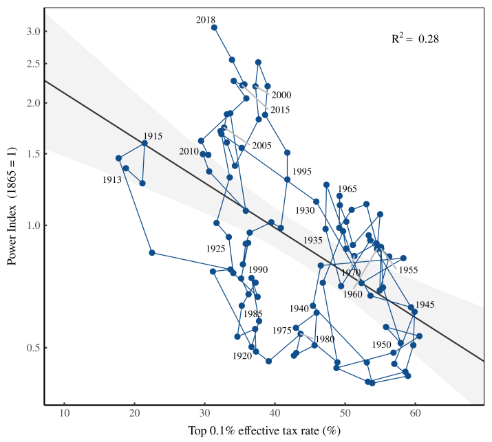
Again, it appears that Bichler and Nitzan are onto something. The struggle to tax the rich — a clear indicator of class conflict — seems to be written on the stock market.
Does the stock market reflect class struggle?
Let’s take stock (pun intended). Bichler and Nitzan propose that stock prices, when compared to wages, reflect the class struggle between capitalists and workers. When capitalists win, stocks should go up. When workers win, stocks should go down.
This claim is just a hypothesis. But it’s one that is surprisingly well-supported by the evidence. When we look at indicators that are obviously about class struggle — strike density, the size of the minimum wage, and the taxation of the rich — we find that they correlate well with Bichler and Nitzan’s power index. When workers strike less, fail to win a living minimum wage, and fail to progressively tax the rich, stock prices rise relative to wages.
Does this evidence mean that Bichler and Nitzan are correct? The scientist in me would answer conservatively. The evidence ‘supports’ Bichler and Nitzan’s hypothesis that the stock market reflects class struggle. But the activist in me would answer more boldly. Karl Marx and Friedrich Engels once proclaimed that “the history of all hitherto existing society is the history of class struggles”. The evidence here suggests an equally bold proclamation: ‘In capitalist societies, the history of class struggle is the history of the stock market’.
taken from here