
Summary
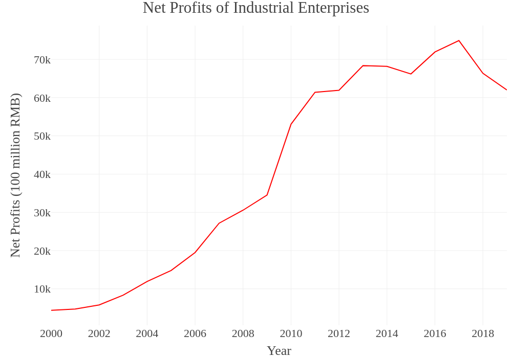
What follows is a lengthy piece, with lots of intricacies about the exact methods used, alongside detailed anatomies of our results. It is, in the end, fairly boring to read closely, and a skim of the data visualizations paired with a read-through of the final section will be enough to grasp the gist of our argument. But we’ll also take some space here to lay out a quick summary of our major points. Overall, we identify a clear decline in the profitability of the Chinese economy over time, and particularly since either 2008 or 2010, depending on the measure. At the same time, the trend in Chinese industry specifically has been slightly different. In all measures, the early 2000s are marked by a brief rise or at least stagnation in profitability. But if we just measure the profitability of the industrial sector, the rise in profitability in this decade is more pronounced. Regardless, however, all the measurements converge in the 2010s. Profitability clearly declines, even in industry, in these later years, beginning in either 2010 or 2011. It, however, does not decline quite as far or as fast as that in the entire economy, relative to its previous trend.
In addition to this, we identify a few key contextual trends in output and investment that are important to understanding the Chinese economy in recent decades. In terms of output, the Tertiary Sector has been increasing its share more or less consistently since the 1990s, first at the expense of the Primary Sector, and, in recent years, at the expense of the Secondary Sector as well.[viii] As of 2019, the Tertiary Sector composed the bulk of national output (53.9%) and the Secondary Sector composed the next biggest share (38.9%), all while the Primary Sector had shrunk from about a quarter (26.5%) in 1990 to less than a tenth (7.1%) by 2019. Below, we break these trends down further, but the most salient point is that Industry still composes the largest single share of output (33.6% in 2018) when compared to all other subsectors, even though it has been shrinking in recent years (its average since 1990 is closer to 40%). But the “Other” sector, which includes many otherwise uncounted services like Health and Education, has been growing rapidly since the mid-2000s, and composes the second largest share (at 22.5% in 2018).[ix]
In terms of investment, we find that fixed asset investment in the entire economy has been rising consistently for the entire period but finally peaks in 2015 or 2016 and then begins a multi-year decline. Investment in residential buildings and fixed asset investment in real estate more generally both follow the exact same pattern, so this is not a case of industrial investment declining in favor of speculation in real estate. In fact, we find that investment in residential buildings has actually been declining as a share of total investment in fixed assets for about thirty years. Any housing bubble that exists cannot be said to have only grown at the expense of investment in other fixed assets. Instead, it’s likely that the housing bubble is part of a much larger asset bubble, which has included speculation and rapid building-out of all kinds of fixed capital. In recent years, this investment in fixed assets has peaked, and the peak has been most pronounced in Manufacturing and Real Estate, though it’s also evident in Mining. The only sectors that have not experienced a decline are Transportation and Warehousing, Utilities, and Agriculture, Forestry and Fishing, all of which compose much smaller shares of both GDP and overall fixed asset investment and are, therefore, not capable of making up for the decline elsewhere.
In our decomposition of the Rate of Profit, these trends in output and fixed asset investment become apparent in changing trends in mechanization and the intensity of the exploitation of labor. Mechanization, or, more accurately, the ratio of the wage bill to capital sunk in plant, equipment, and other non-wage costs, has tended to increase since the 1990s, slowing a little in the mid-2000s, but then increasing even faster in the 2010s. The slowing in this ratio in the 2000s was caused by the influx of cheap migrant labor from the countryside into the coastal export hubs, which enabled more labor-intensive methods of production to prevail in these years. In the aftermath of the 2008 crisis, however—which tended to coincide with less and less favorable demographic trends leading to labor supply issues—production began to be mechanized at a faster rate.
In the end, we periodize profitability and its related trends into three loose decades: the first, from 1993-2000, is a period of “Transitional Stagnation,” capped by the restructuring of the industrial belt inherited from the socialist developmental regime. The second, from 2000-2008, is the period of “Export Production,” which saw the restructuring completed and the rapid growth of the sunbelt export industries. The third, from 2009-2018, is a period of “Stimulus and Stagnation,” during which the post-crisis stimulus buoys profitability briefly, after which it undergoes a general decline before stabilizing around a new, lower norm.
To see these trends laid out visually, scan ahead to the figures. For more detail on the theory and methods used throughout, we will now pick up where we left off above.
read here